BE. Jewelry
[Silversmithing Small Business ]
“Embody nostalgia and a gothic whimsy that illumates the 'little things', through brand identity, packaging, and web design. ”
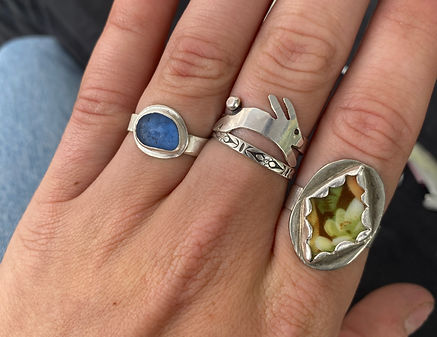
BE. jewelry crafts collections of silver pieces, bringing small moments from nature to peoples jewelry boxes. The brand identity must show this while letting the jewelry have it's shining moment.
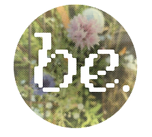
Logo
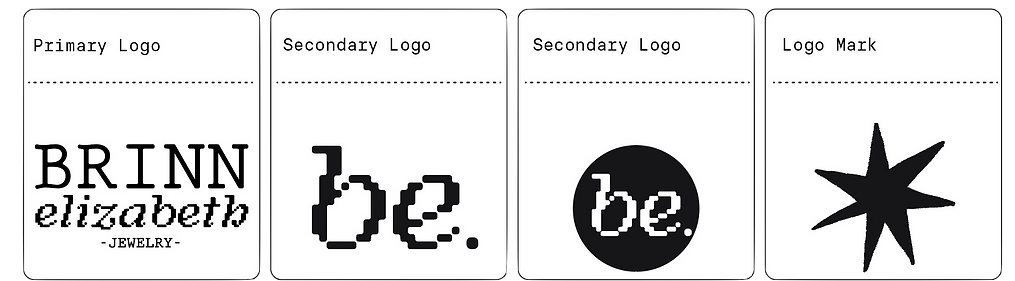
Adapted sketches and early iterations into a well-rounded system that can succesfully be implimented across many platforms
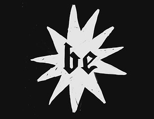
Original Logo used hand drawn elements and more gothic forms. Good for small applications but doesnt have enough variability and scale.
[the star imagery is carried through to the final design]
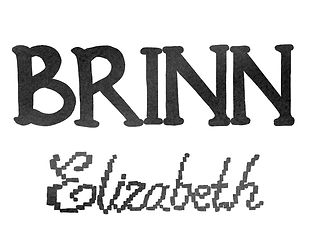
Hand drawn sketches incorporated a pixel script for a softer look. Felt a little disconnected and not quite finalized.
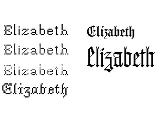
Explored many typefaces that had gothic, handmade, and softer script fonts that captured the nostalgia and whimsy the brand wants to show.
Packaging
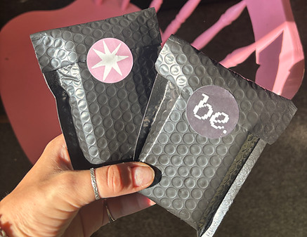
The logo was applied to stickers and display cards to incorperate branding to all aspects of the business.
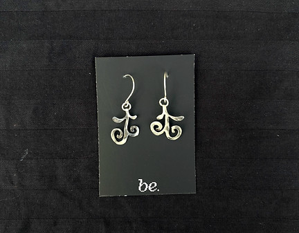
Logo on jewelry cards
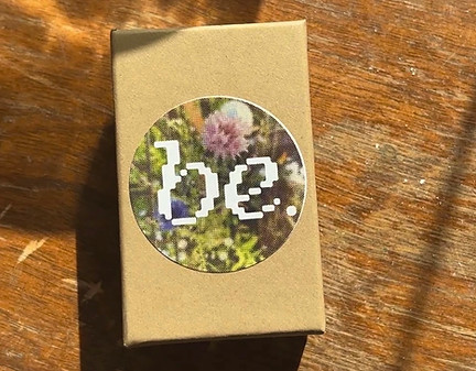
Stickers on jewelry boxes
Website
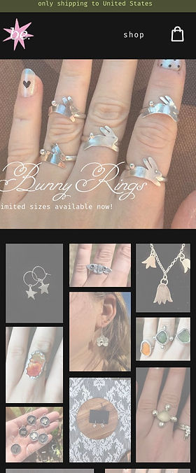
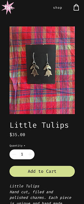
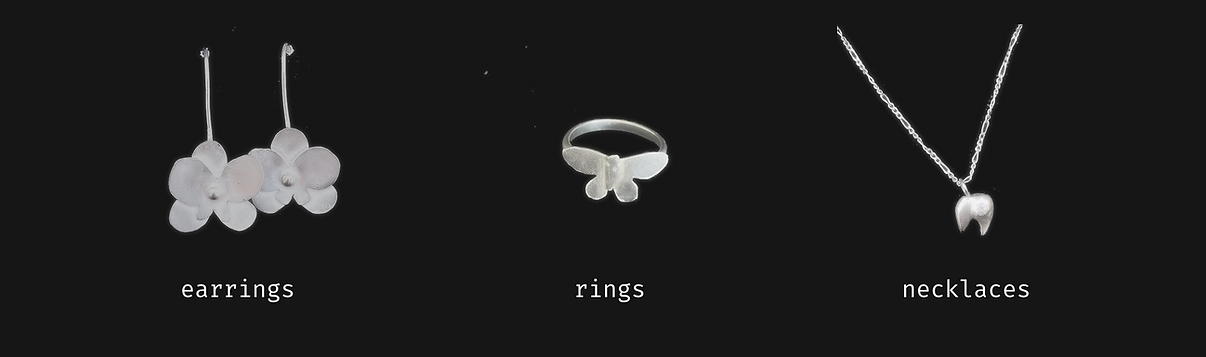
Created for mobile and desktop to maximize navigation while highlighting specific best sellers. A 'Where to Find Me' page was added since in-person markets are a big part of this business outreach and clientel.